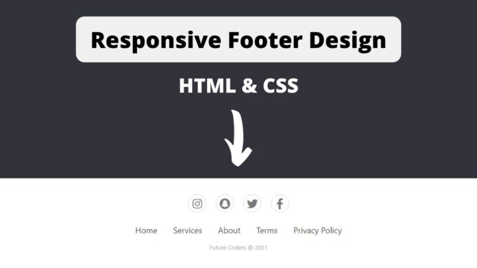
Hello Coders, In this article we are going to learn how to build responsive footer section using HTML and CSS.
What is a Footer?
Footers are commonly used in all the websites. Footers are actually used to add information such as contact info, linking to other socials or linking to the pages which are less or more important. Having a footer adds a nice user experience to the Users. A Common tag used for creating a footer in html is <footer>. This is an html5 semantic element.
What can we add inside Footer?
- Copyright
- Quick Links
- Social Links
- Quote
- Contact
- Privacy Policy
- Terms of service
Below I have Provided all the necessary video tutorial as well as complete source code of this project.
Video Tutorial | Build Responsive Footer with HTML and CSS
This is a step by step video tutorial, Here in this video I have shown how to built footer section and make it responsive. I have also shown how to import icons from the google font icons. This video is perfect if you are a complete beginner.
Source Code | Build Simple Responsive Footer with HTML and CSS
Below I have provided complete html and css source code of this project. You can also download the source code by clicking on the download button at the bottom of this article.
How do I Create Footer section in HTML? HTML Source Code
Create an index.html file. We will be using the icons from the font awesome. Below I have provided the import code of font awesome. Copy the below codes.
<!DOCTYPE html>
<html lang="en">
  <head>
    <meta charset="UTF-8" />
    <meta http-equiv="X-UA-Compatible" content="IE=edge" />
    <meta name="viewport" content="width=device-width, initial-scale=1.0" />
    <title>Simple Footer</title>
    <link rel="stylesheet" href="styles.css" />
    <link
      rel="stylesheet"
      href="https://cdnjs.cloudflare.com/ajax/libs/font-awesome/5.15.3/css/all.min.css"
      integrity="sha512-iBBXm8fW90+nuLcSKlbmrPcLa0OT92xO1BIsZ+ywDWZCvqsWgccV3gFoRBv0z+8dLJgyAHIhR35VZc2oM/gI1w=="
      crossorigin="anonymous"
      referrerpolicy="no-referrer"
    />
  </head>
  <body>
    <section class="footer">
      <div class="social">
        <a href="#"><i class="fab fa-instagram"></i></a>
        <a href="#"><i class="fab fa-snapchat"></i></a>
        <a href="#"><i class="fab fa-twitter"></i></a>
        <a href="#"><i class="fab fa-facebook-f"></i></a>
      </div>

      <ul class="list">
        <li>
          <a href="#">Home</a>
        </li>
        <li>
          <a href="#">Services</a>
        </li>
        <li>
          <a href="#">About</a>
        </li>
        <li>
          <a href="#">Terms</a>
        </li>
        <li>
          <a href="#">Privacy Policy</a>
        </li>
      </ul>
      <p class="copyright">Future Coders @ 2021</p>
    </section>
  </body>
</html>
How do I design Footer section in CSS? CSS Source Code
Create an styles.css file. Copy the below codes.
* {
  margin: 0;
  padding: 0;
  box-sizing: border-box;
}

body {
  font-family: 'Segoe UI';
  font-weight: 400;
  background-color: #ededed;
}

.footer {
  padding: 40px 0;
  background-color: #ffffff;
}

.footer .social {
  text-align: center;
  padding-bottom: 25px;
  color: #4b4c4d;
}

.footer .social a {
  font-size: 24px;
  color: inherit;
  border: 1px solid #ccc;
  width: 40px;
  height: 40px;
  line-height: 38px;
  display: inline-block;
  text-align: center;
  border-radius: 50%;
  margin: 0 8px;
  opacity: 0.75;
}

.footer .social a:hover {
  opacity: 0.9;
}

.footer ul {
  margin-top: 0;
  padding: 0;
  list-style: none;
  text-align: center;
  font-size: 18px;
  line-height: 1.6;
  margin-bottom: 0;
}

.footer ul a {
  color: inherit;
  text-decoration: none;
  opacity: 0.8;
}

.footer ul li {
  display: inline-block;
  padding: 0 15px;
}

.footer ul a:hover {
  opacity: 1;
}

.footer .copyright {
  margin-top: 15px;
  text-align: center;
  font-size: 13px;
  color: #aaa;
}
Done! You can download the complete source code by clicking on download button below.
Conclusion
In this article I have shown you how to build a responsive footer section using html and css. We have also used icons from the google font icons to link to social media.


