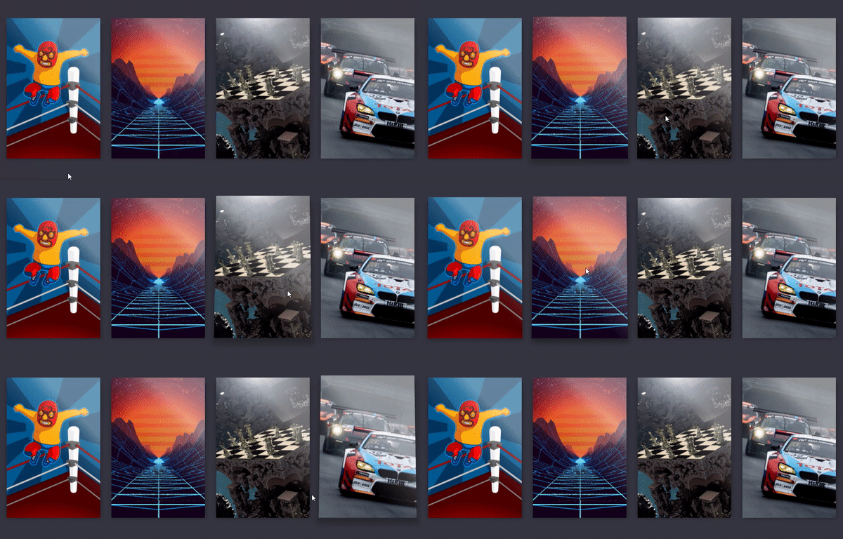
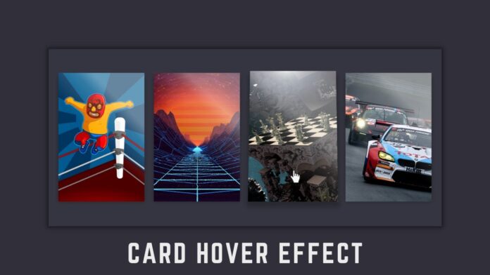
Hello Coders, In this article we are going to learn how to create Card Hover Effects using HTML and CSS.
Hover effects are used almost everywhere on websites. For example we want a button to change its color when we place cursor on it. In this article I have provided the necessary video tutorial as well as complete source code for you.
Card Hover Effects in HTML and CSS | Video Tutorial
In the above video I have shown how to build Card hover effect with html and css in a step by step way. If you are a complete beginner to html and css, consider following the video tutorial.
Card Hover Effect with HTML and CSS | Source Code
Below I have provided both html and css code of this project. You can also download all the Images which I have used and you can also get complete source code of this project by clicking on the download button at the bottom of this article.
How do I create Card hover effect in HTML? Free HTML Source Code
Create an index.html file and add all the basic tags of an html document such as html, head, title, body tags. Follow the html code below.
HTML Code : Inside the body create a div with class ‘container’. Inside it create 4 divs with class name ‘game-card’. You can see in the below html code that inside each of those ‘game-card’ divs, I have created another div with class ‘game-card__cover’ and have set an image as their background.
You can download the images that I have used from the download button at the bottom of this article.
<!DOCTYPE html>
<html lang="en">
  <head>
    <meta charset="UTF-8" />
    <meta http-equiv="X-UA-Compatible" content="IE=edge" />
    <meta name="viewport" content="width=device-width, initial-scale=1.0" />
    <title>Game Card Hover Effect</title>
    <link rel="stylesheet" href="styles.css" />
  </head>
  <body>
    <div class="container">
      <div class="game-card">
        <div class="game-card__cover" style="background-image: url(images/game1.jpg)"></div>
      </div>
      <div class="game-card">
        <div class="game-card__cover" style="background-image: url(images/game2.jpg)"></div>
      </div>
      <div class="game-card">
        <div class="game-card__cover" style="background-image: url(images/game3.jpg)"></div>
      </div>
      <div class="game-card">
        <div class="game-card__cover" style="background-image: url(images/game4.jpg)"></div>
      </div>
    </div>
  </body>
</html>
How do I design Card hover effect in CSS? Free CSS Source Code
Create a styles.css file and also dont forget to link the file to our html document. And then follow the below css code.
CSS Code : Below I have provided the complete css code. Start typing it from top to bottom and start seeing the changes it makes.
* {
  margin: 0;
  padding: 0;
  box-sizing: border-box;
}

body {
  display: flex;
  justify-content: center;
  align-items: center;
  min-height: 100vh;
  background: #353540;
}

.container {
  display: grid;
  grid-template-columns: repeat(4, 1fr);
  grid-gap: 30px;
  width: 100%;
  max-width: 1200px;
  padding: 30px;
}

.game-card {
  position: relative;
  z-index: 1;
  width: 100%;
  padding-bottom: 150%;
  perspective: 1000px;
}

.game-card__cover {
  position: absolute;
  z-index: 1;
  top: 0;
  left: 0;
  width: 100%;
  height: 100%;
  overflow: hidden;
  background-image: linear-gradient(120deg, #f6d365 0%, #fda085 100%);
  background-size: cover;
  perspective-origin: 50% 50%;
  transform-style: preserve-3d;
  transform-origin: top center;
  will-change: transform;
  transform: skewX(0.001deg);
  transition: transform 0.35s ease-in-out;
}

.game-card__cover::after {
  display: block;
  content: '';
  position: absolute;
  z-index: 100;
  top: 0;
  left: 0;
  width: 100%;
  height: 120%;
  background: linear-gradient(
    226deg,
    rgba(255, 255, 255, 0.4) 0%,
    rgba(255, 255, 255, 0.4) 35%,
    rgba(255, 255, 255, 0.2) 42%,
    rgba(255, 255, 255, 0) 60%
  );
  transform: translateY(-20%);
  will-change: transform;
  transition: transform 0.65s cubic-bezier(0.18, 0.9, 0.58, 1);
}

.game-card:hover .game-card__cover {
  transform: rotateX(7deg) translateY(-6px);
}
.game-card:hover .game-card__cover::after {
  transform: translateY(0%);
}

.game-card::before {
  display: block;
  content: '';
  position: absolute;
  top: 5%;
  left: 5%;
  width: 90%;
  height: 90%;
  background: rgba(0, 0, 0, 0.5);
  box-shadow: 0 6px 12px 12px rgba(0, 0, 0, 0.4);
  will-change: opacity;
  transform-origin: top center;
  transform: skewX(0.001deg);
  transition: transform 0.35s ease-in-out, opacity 0.5s ease-in-out;
}
.game-card:hover::before {
  opacity: 0.6;
  transform: rotateX(7deg) translateY(-6px) scale(1.05);
}
and Finally this is what you will have at the end.

Thank you for reading this article
Credits: Andrew Hawkes
Download Source Code of Card Hover Effects :


